Toggle Switch
View in LexiconToggle provide users with different selection and activation tools.
| install | yarn add @clayui/form |
|---|---|
| version |  |
| use | import {ClayToggle} from '@clayui/form'; |
Table of Contents
Example
Behavioral
You may want the Toggle Switch to behave with a Radio or Checkbox but have the appearance of a switch.
Checkbox
Radio
Disabled
Composable
With Text
You can display additional text with the toggle switch by adding the .toggle-switch-text class to the text element. Use the .toggle-switch-text-left and .toggle-switch-text-right classes to position the text on the left and right side of the toggle switch, respectively.
With Icons
Add <span className="button-icon button-icon-on icon-volume-up toggle-switch-icon"/> to add an icon to the switch for the on position.
Add <span className="button-icon button-icon-off icon-volume-off toggle-switch-icon"/> to add an icon to the switch for the off position.
Alternatively, you can add <span className="icon-ok toggle-switch-icon toggle-switch-icon-on"/> to add an icon to the switch for the on position.
Alternatively, you can add <span className="icon-remove toggle-switch-icon toggle-switch-icon-off"/> to add an icon to the switch for the off position.
Extending Toggles
This section explains how to customize toggles. Use at your own risk.
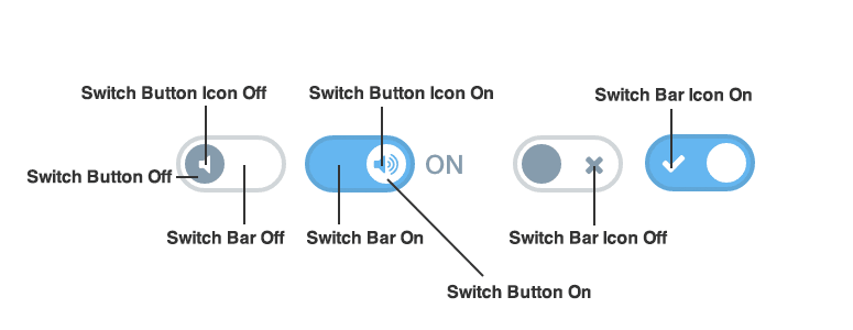
-
Customize the
toggle-switch button in the off
position with
.toggle-switch-check:empty ~ .toggle-switch-bar:after {}. -
Customize the
toggle-switch button icon in the off
position with
.toggle-switch-check:empty ~ .toggle-switch-bar .toggle-switch-icon.button-icon {}. -
Customize the
toggle-switch bar in the off
position with
.toggle-switch-check:empty ~ .toggle-switch-bar:before {}. -
Customize the
toggle-switch bar icon in the off
position with
.toggle-switch-check:empty ~ .toggle-switch-bar .toggle-switch-icon-off {}. -
Customize the
toggle-switch button in the on
position with
.toggle-switch-check:checked ~ .toggle-switch-bar:after {}. -
Customize the
toggle-switch button icon in the on
position with
.toggle-switch-check:checked ~ .toggle-switch-bar .toggle-switch-icon.button-icon. -
Customize the
toggle-switch bar in the on
position with
.toggle-switch-check:checked ~ .toggle-switch-bar:before {}. -
Customize the
toggle-switch bar icon in the on
position with
.toggle-switch-check:checked ~ .toggle-switch-bar .toggle-switch-icon-on {}.