Card
View in LexiconCards are a specific form of data visualization focused mainly on displaying images.
| install | yarn add @clayui/card |
|---|---|
| version |  |
| use | import ClayCard from '@clayui/card'; |
Table of Contents
- Example
- Content Types
- Body
- Captions
- Images
- Header and Footer
- Dividers
- Variations
- Image Card
- File Card
- User Card
- Horizontal Card
- Interactive Card
- Default
- Horizontal
- States
- Hover
- Active
- Empty
- Helpers
- Checkbox
- Radio
- Horizontal Card with autofit-col-*
- Padded Horizontal Cards
- Truncating Text Inside Card
- Card Row Content Alignment Helpers
- Rounded
- Card Page
- Card Page Equal Height
- Card Page with Bootstrap’s Grid System
- Card Page Item Asset
- Card Page Item Directory
Example
Card title
Some quick example text to build on the card title and make up the bulk of the card’s content.
Go somewhereSnippet
<div className="card" style={{width: '18rem'}}>
	<div className="card-body">
		<h5 className="card-title">Card title</h5>
		<p className="card-text">
			Some quick example text to build on the card title and make up the
			bulk of the card's content.
		</p>
		<a href="#" className="btn btn-primary">Go somewhere</a>
	</div>
</div>
Content Types
Cards support a wide variety of content, including images, text, list groups, links, and more. Below are examples of what’s supported.
Body
The building block of a card is the .card-body. Use it whenever you need a padded section within a card.
Snippet
<div className="card">
  <div className="card-body">This is some text within a card body.</div>
</div>
Captions
Card titles are used by adding .card-title to a <h*> tag. In the same way, links are added and placed next to each other by adding .card-link to an <a> tag.
Subtitles are used by adding a .card-subtitle to a <h*> tag. If the .card-title and the .card-subtitle items are placed in a .card-body item, the card title and subtitle are aligned nicely.
Card title
Card subtitle
Some quick example text to build on the card title and make up the bulk of the card’s content.
Card linkAnother linkSnippet
<div className="card" style={{width: '18rem'}}>
	<div className="card-body">
		<h5 className="card-title">Card title</h5>
		<h6 className="card-subtitle mb-2 text-muted">Card subtitle</h6>
		<p className="card-text">
			Some quick example text to build on the card title and make up the
			bulk of the card's content.
		</p>
		<a href="#" className="card-link">Card link</a>
		<a href="#" className="card-link">Another link</a>
	</div>
</div>
Images
Use classes card-item-first and card-item-last on elements that appear at the beginning or ending of your card. It styles the border-radius to match the card’s border-radius. These classes work similar to Bootstrap 4’s .card-img-top and .card-img-bottom but also covers left and right.

Joe Bloggs
Administrator
Wings eu, pumpkin spice robusta, kopi-luwak mocha caffeine froth grounds.
Space Program
Because you live life on the edge of space.
Snippet
<div className="card card-rounded">
	<div className="aspect-ratio card-item-first">
		<img
			alt="thumbnail"
			className="aspect-ratio-item aspect-ratio-item-fluid"
			src="/images/thumbnail_hot_air_ballon.jpg"
		/>
	</div>
	<div className="card-body" style={{textAlign: 'center'}}>
		<h3 className="card-title">Joe Bloggs</h3>
		<p className="card-subtitle">Administrator</p>
		<p className="card-text">
			Wings eu, pumpkin spice robusta, kopi-luwak mocha caffeine froth
			grounds.
		</p>
	</div>
</div>
<div className="card card-horizontal card-rounded">
	<div className="card-row">
		<div className="autofit-col autofit-col-expand autofit-col-gutters">
			<section className="autofit-section">
				<h3 className="card-title">Space Program</h3>
				<div className="card-divider"></div>
				<p className="card-text">
					Because you live life on the edge of space.
				</p>
			</section>
		</div>
		<div className="autofit-col">
			<img
				className="card-item-last"
				src="/images/thumbnail_dock.jpg"
				style={{width: '150px'}}
			/>
		</div>
	</div>
</div>
Header and Footer
Add an optional header and/or footer within a card.
Special title treatment
With supporting text below as a natural lead-in to additional content.
Go somewhereSnippet
<div className="card">
  <div className="card-header">Featured</div>
  <div className="card-body">
    <h5 className="card-title">Special title treatment</h5>
    <p className="card-text">
      With supporting text below as a natural lead-in to additional content.
    </p>
    <a href="#" className="btn btn-primary">Go somewhere</a>
  </div>
</div>
Card headers can be styled by adding .card-header to <h*> elements.
Featured
Special title treatment
With supporting text below as a natural lead-in to additional content.
Go somewhereSnippet
<div className="card">
  <h5 className="card-header">Featured</h5>
  <div className="card-body">
    <h5 className="card-title">Special title treatment</h5>
    <p className="card-text">
      With supporting text below as a natural lead-in to additional content.
    </p>
    <a href="#" className="btn btn-primary">Go somewhere</a>
  </div>
</div>
Dividers
Use <div className="card-divider"></div> to create a horizontal division between content inside a card.
Title
autofit-col-expand
Snippet
<div className="card card-horizontal">
  <div className="card-row">
    <div className="autofit-col autofit-col-expand">
      <section className="autofit-section">autofit-col-expand</section>
    </div>
    <div className="autofit-col autofit-col-expand">
      <section className="autofit-section">
        <h3 className="card-title">Title</h3>
        <div className="card-divider"></div>
        <p className="card-text">autofit-col-expand</p>
      </section>
    </div>
  </div>
</div>
Variations
Image Card
Just add image-card class on the same element that card class have being added.
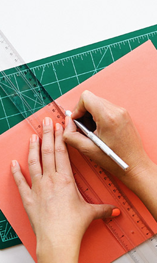
 JPG
JPGthumbnail_coffee.jpg
Author Action
empty-background.png
Author Action
lexicon_icon_camera_av93ii2oofffmmmsjf2332.svg
Author Action
Snippet
<div className="card card-type-asset image-card">
  <div className="aspect-ratio card-item-first">
    <img
      alt="thumbnail"
      className="aspect-ratio-item aspect-ratio-item-center-middle aspect-ratio-item-fluid"
      src="/images/thumbnail_coffee.jpg"
    />
    <span className="sticker sticker-bottom-left sticker-danger">JPG</span>
  </div>
  <div className="card-body">
    <div className="card-row">
      <div className="autofit-col autofit-col-expand">
        <section className="autofit-section">
          <h3 className="card-title" title="thumbnail_coffee.jpg">
            <span className="text-truncate-inline">
              <a className="text-truncate" href="#1">thumbnail_coffee.jpg</a>
            </span>
          </h3>
          <p className="card-subtitle">
            <span className="text-truncate-inline">
              <span className="text-truncate">Author Action</span>
            </span>
          </p>
        </section>
      </div>
    </div>
  </div>
</div>
<div className="card card-type-asset image-card">
  <div className="aspect-ratio card-item-first">
    <span className="sticker sticker-bottom-left sticker-info">PNG</span>
  </div>
  <div className="card-body">
    <div className="card-row">
      <div className="autofit-col autofit-col-expand">
        <section className="autofit-section">
          <h3 className="card-title" title="empty-background.png">
            <span className="text-truncate-inline">
              <a className="text-truncate" href="#1">empty-background.png</a>
            </span>
          </h3>
          <p className="card-subtitle" title="Author Action">
            <span className="text-truncate-inline">
              <span className="text-truncate">Author Action</span>
            </span>
          </p>
        </section>
      </div>
    </div>
  </div>
</div>
<div className="card card-type-asset image-card">
  <div className="aspect-ratio card-item-first">
    <div
      className="aspect-ratio-item aspect-ratio-item-center-middle aspect-ratio-item-fluid card-type-asset-icon"
    >
      <svg
        className="lexicon-icon lexicon-icon-camera"
        focusable="false"
        role="presentation"
      >
        <use href="/icons.svg#camera"></use>
      </svg>
    </div>
    <span className="sticker sticker-bottom-left sticker-warning">SVG</span>
  </div>
  <div className="card-body">
    <div className="card-row">
      <div className="autofit-col autofit-col-expand">
        <section className="autofit-section">
          <h3
            className="card-title"
            title="lexicon_icon_camera_av93ii2oofffmmmsjf2332.svg"
          >
            <span className="text-truncate-inline">
              <a className="text-truncate" href="#1"
                >lexicon_icon_camera_av93ii2oofffmmmsjf2332.svg</a
              >
            </span>
          </h3>
          <p className="card-subtitle text-truncate" title="Author Action">
            <span className="text-truncate-inline">
              <span className="text-truncate">Author Action</span>
            </span>
          </p>
        </section>
      </div>
    </div>
  </div>
</div>
File Card
deliverable.doc
Stevie Ray Vaughn
Snippet
<div className="card card-type-asset file-card">
  <div className="aspect-ratio card-item-first">
    <div
      className="aspect-ratio-item aspect-ratio-item-center-middle aspect-ratio-item-fluid card-type-asset-icon"
    >
      <svg
        className="lexicon-icon lexicon-icon-documents-and-media"
        focusable="false"
        role="presentation"
      >
        <use href="/icons.svg#documents-and-media"></use>
      </svg>
    </div>
    <span className="sticker sticker-bottom-left sticker-danger">DOC</span>
  </div>
  <div className="card-body">
    <div className="card-row">
      <div className="autofit-col autofit-col-expand">
        <section className="autofit-section">
          <h3 className="card-title" title="deliverable.doc">
            <span className="text-truncate-inline">
              <a className="text-truncate" href="#1">deliverable.doc</a>
            </span>
          </h3>
          <p className="card-subtitle" title="Stevie Ray Vaughn">
            <span className="text-truncate-inline">
              <span className="text-truncate">Stevie Ray Vaughn</span>
            </span>
          </p>
          <div className="card-detail">
            <span className="label label-success">
              <span className="label-item label-item-expand">Approved</span>
            </span>
          </div>
        </section>
      </div>
    </div>
  </div>
</div>
User Card
Snippet
<div className="card card-type-asset user-card">
  <div className="aspect-ratio card-item-first">
    <div
      className="aspect-ratio-item aspect-ratio-item-center-middle aspect-ratio-item-fluid card-type-asset-icon"
    >
      <span className="sticker sticker-secondary sticker-user-icon">
        <span className="sticker-overlay">
          <img
            alt="thumbnail"
            className="sticker-img"
            src="/images/long_user_image.png"
          />
        </span>
      </span>
    </div>
  </div>
  <div className="card-body">
    <div className="card-row">
      <div className="autofit-col autofit-col-expand">
        <section className="autofit-section">
          <h3 className="card-title" title="User Name">
            <span className="text-truncate-inline">
              <a className="text-truncate" href="#1">User Name</a>
            </span>
          </h3>
          <p className="card-subtitle" title="Latest Action">
            <span className="text-truncate-inline">
              <span className="text-truncate">Latest Action</span>
            </span>
          </p>
        </section>
      </div>
    </div>
  </div>
</div>
Horizontal Card
Snippet
<div className="card card-horizontal card-type-directory">
  <div className="card-body">
    <div className="card-row">
      <div className="autofit-col">
        <span className="sticker">
          <span className="inline-item">
            <svg
              className="lexicon-icon lexicon-icon-folder"
              focusable="false"
              role="presentation"
            >
              <use href="/icons.svg#folder"></use>
            </svg>
          </span>
        </span>
      </div>
      <div className="autofit-col autofit-col-expand autofit-col-gutters">
        <section className="autofit-section">
          <h3
            className="card-title"
            title="ReallySuperInsanelyJustIncrediblyLongAndTotallyNotPossibleWordButWeAreReallyTryingToCoverAllOurBasesHereJustInCaseSomeoneIsNutsAsPerUsual"
          >
            <span className="text-truncate-inline">
              <a className="text-truncate" href="#1"
                >ReallySuperInsanelyJustIncrediblyLongAndTotallyNotPossibleWordButWeAreReallyTryingToCoverAllOurBasesHereJustInCaseSomeoneIsNutsAsPerUsual</a
              >
            </span>
          </h3>
        </section>
      </div>
    </div>
  </div>
</div>
Interactive Card
Default

Widget Page

Blog
Snippet
<div
  className="card card-interactive card-interactive-primary card-type-template template-card"
  tabindex="0"
>
  <div className="aspect-ratio card-item-first">
    <div
      className="aspect-ratio-item aspect-ratio-item-center-middle aspect-ratio-item-flush"
    >
      <img src="/images/portlet.svg" />
    </div>
  </div>
  <div className="card-body">
    <h3 className="card-title">Widget Page</h3>
    <div className="card-text">Build a page by adding widgets and content.</div>
  </div>
</div>
<a
  className="card card-interactive card-interactive-primary card-type-template template-card"
  href="#1"
>
  <span className="aspect-ratio">
    <span
      className="aspect-ratio-item aspect-ratio-item-center-middle aspect-ratio-item-flush"
    >
      <img src="/images/content.svg" />
    </span>
  </span>
  <span className="card-body">
    <span className="card-title">Content Page</span>
    <span className="card-text"
      >This is an example of card-type-template using an anchor tag.</span
    >
  </span>
</a>
<div
  className="card card-interactive card-interactive-primary card-type-template template-card"
  tabindex="0"
>
  <div className="aspect-ratio">
    <div
      className="aspect-ratio-item aspect-ratio-item-center-middle aspect-ratio-item-flush"
    >
      <svg
        className="lexicon-icon lexicon-icon-page-template"
        focusable="false"
        role="presentation"
      >
        <use href="/icons.svg#page-template"></use>
      </svg>
    </div>
  </div>
  <div className="card-body">
    <h3 className="card-title">Blog</h3>
  </div>
</div>
Horizontal
Snippet
<div
  className="card card-interactive card-interactive-primary card-type-template template-card-horizontal"
  tabindex="0"
>
  <div className="card-body">
    <div className="card-row">
      <div className="autofit-col">
        <span className="sticker">
          <span className="inline-item">
            <svg
              className="lexicon-icon lexicon-icon-square-hole"
              focusable="false"
              role="presentation"
            >
              <use href="/icons.svg#square-hole"></use>
            </svg>
          </span>
        </span>
      </div>
      <div className="autofit-col autofit-col-expand">
        <div className="autofit-section">
          <div className="card-title" title="Content Page">
            <span className="text-truncate-inline">
              <span className="text-truncate">Content Page</span>
            </span>
          </div>
        </div>
      </div>
    </div>
  </div>
</div>
<a
  className="card card-interactive card-interactive-primary card-type-template template-card-horizontal"
  href="#1"
>
  <span className="card-body">
    <span className="card-row">
      <span className="autofit-col">
        <span className="sticker">
          <span className="inline-item">
            <svg
              className="lexicon-icon lexicon-icon-page"
              focusable="false"
              role="presentation"
            >
              <use href="/icons.svg#page"></use>
            </svg>
          </span>
        </span>
      </span>
      <span className="autofit-col autofit-col-expand">
        <span className="autofit-section">
          <span className="card-title" title="Content Page">
            <span className="text-truncate-inline">
              <span className="text-truncate">Full Page Application</span>
            </span>
          </span>
        </span>
      </span>
    </span>
  </span>
</a>
<div
  className="card card-interactive card-interactive-primary card-type-template template-card-horizontal"
  tabindex="0"
>
  <div className="card-body">
    <div className="card-row">
      <div className="autofit-col">
        <span className="sticker">
          <span className="inline-item">
            <svg
              className="lexicon-icon lexicon-icon-page"
              focusable="false"
              role="presentation"
            >
              <use href="/icons.svg#page"></use>
            </svg>
          </span>
        </span>
      </div>
      <div className="autofit-col autofit-col-expand">
        <div className="autofit-section">
          <div className="card-title" title="Content Page">
            <span className="text-truncate-inline">
              <span className="text-truncate">Link to a Page of This Site</span>
            </span>
          </div>
        </div>
      </div>
    </div>
  </div>
</div>
States
Hover
thumbnail_coffee.jpg
Author Action
Snippet
<div
  className="card-type-asset form-check form-check-card form-check-top-left image-card"
>
  <div className="card">
    <div className="aspect-ratio card-item-first">
      <div className="custom-control custom-checkbox">
        <label>
          <input className="custom-control-input" type="checkbox" />
          <span className="custom-control-label"></span>
          <img
            alt="thumbnail"
            className="aspect-ratio-item aspect-ratio-item-center-middle aspect-ratio-item-fluid"
            src="/images/thumbnail_coffee.jpg"
          />
          <span className="sticker sticker-bottom-left sticker-danger"
            >JPG</span
          >
        </label>
      </div>
    </div>
    <div className="card-body">
      <div className="card-row">
        <div className="autofit-col autofit-col-expand">
          <section className="autofit-section">
            <h3 className="card-title" title="thumbnail_coffee.jpg">
              <span className="text-truncate-inline">
                <a className="text-truncate" href="#1">thumbnail_coffee.jpg</a>
              </span>
            </h3>
            <p className="card-subtitle" title="Author Action">
              <span className="text-truncate-inline">
                <span className="text-truncate">Author Action</span>
              </span>
            </p>
            <div className="card-detail">
              <span className="label label-success">
                <span className="label-item label-item-expand">Approved</span>
              </span>
            </div>
          </section>
        </div>
        <div className="autofit-col">
          <div className="dropdown dropdown-action">
            <a
              aria-expanded="false"
              aria-haspopup="true"
              className="component-action dropdown-toggle"
              data-toggle="dropdown"
              href="#1"
              role="button"
            >
              <svg
                className="lexicon-icon lexicon-icon-ellipsis-v"
                focusable="false"
                role="presentation"
              >
                <use href="/icons.svg#ellipsis-v"></use>
              </svg>
            </a>
            <ul className="dropdown-menu dropdown-menu-right">
              <li>
                <a className="dropdown-item" href="#1">Download</a>
              </li>
              <li>
                <a className="dropdown-item" href="#1">Edit</a>
              </li>
            </ul>
          </div>
        </div>
      </div>
    </div>
  </div>
</div>
Active
Just add active class on the element where card class was placed.
Widget Page
Snippet
<div
  className="card card-interactive card-interactive-primary card-type-template template-card active"
  tabindex="0"
>
  <div className="aspect-ratio card-item-first">
    <div
      className="aspect-ratio-item aspect-ratio-item-center-middle aspect-ratio-item-flush"
    >
      <img src="/images/portlet.svg" />
    </div>
  </div>
  <div className="card-body">
    <h3 className="card-title">Widget Page</h3>
    <div className="card-text">Build a page by adding widgets and content.</div>
  </div>
</div>
Empty
By default, when adding image-card class and inside the element that contains image-card, exists a aspect-ratio class. A transparent background will be setted.
empty-background.png
Author Action
Snippet
<div className="card card-type-asset image-card">
  <div className="aspect-ratio card-item-first">
    <span className="sticker sticker-bottom-left sticker-info">PNG</span>
  </div>
  <div className="card-body">
    <div className="card-row">
      <div className="autofit-col autofit-col-expand">
        <section className="autofit-section">
          <h3 className="card-title" title="empty-background.png">
            <span className="text-truncate-inline">
              <a className="text-truncate" href="#1">empty-background.png</a>
            </span>
          </h3>
          <p className="card-subtitle" title="Author Action">
            <span className="text-truncate-inline">
              <span className="text-truncate">Author Action</span>
            </span>
          </p>
        </section>
      </div>
    </div>
  </div>
</div>
Helpers
Checkbox
To make the whole card clickable just wrap the checkbox and card in:
Snippet
<div className="form-check form-check-card form-check-top-left">
  <label className="form-check-label">
    <input className="form-check-input" type="checkbox" />
    <div className="card">...</div>
  </label>
</div>
Snippet
<div
  className="card-type-asset form-check form-check-card form-check-top-left image-card"
>
  <div className="card">
    <div className="aspect-ratio card-item-first">
      <label className="form-check-label">
        <input className="form-check-input" type="checkbox" />
        <span className="sticker sticker-bottom-left sticker-danger">JPG</span>
      </label>
    </div>
    <div className="card-body">
      <div className="card-row">
        <div className="autofit-col autofit-col-expand">
          <section className="autofit-section">
            <h3 className="card-title">
              <span className="text-truncate-inline">
                <span className="text-truncate"
                  >Aldcott Gage George Polwarth-Kitchener</span
                >
              </span>
            </h3>
            <p className="card-subtitle" title="empty.jpg">
              <span className="text-truncate-inline">
                <a className="text-truncate">empty.jpg</a>
              </span>
            </p>
            <div className="card-detail">
              <span className="label label-success">
                <span className="label-item label-item-expand">Approved</span>
              </span>
            </div>
          </section>
        </div>
        <div className="autofit-col">
          <div className="dropdown dropdown-action">
            <a
              aria-expanded="false"
              aria-haspopup="true"
              className="component-action dropdown-toggle"
              data-toggle="dropdown"
              href="#1"
              role="button"
            >
              <svg
                className="lexicon-icon lexicon-icon-ellipsis-v"
                focusable="false"
                role="presentation"
              >
                <use href="/icons.svg#ellipsis-v"></use>
              </svg>
            </a>
            <ul className="dropdown-menu dropdown-menu-right">
              <li>
                <a className="dropdown-item" href="#1">Download</a>
              </li>
              <li>
                <a className="dropdown-item" href="#1">Edit</a>
              </li>
            </ul>
          </div>
        </div>
      </div>
    </div>
  </div>
</div>
<div
  className="card-type-directory form-check form-check-card form-check-middle-left"
>
  <label className="form-check-label">
    <input className="form-check-input" type="checkbox" />
    <div className="card card-horizontal">
      <div className="card-body">
        <div className="card-row">
          <div className="autofit-col">
            <span className="sticker">
              <span className="inline-item">
                <svg
                  className="lexicon-icon lexicon-icon-folder"
                  focusable="false"
                  role="presentation"
                >
                  <use href="/icons.svg#folder"></use>
                </svg>
              </span>
            </span>
          </div>
          <div className="autofit-col autofit-col-expand autofit-col-gutters">
            <section className="autofit-section">
              <h3
                className="card-title"
                title="ReallySuperInsanelyJustIncrediblyLongAndTotallyNotPossibleWordButWeAreReallyTryingToCoverAllOurBasesHereJustInCaseSomeoneIsNutsAsPerUsual"
              >
                <span className="text-truncate-inline">
                  <span className="text-truncate"
                    >ReallySuperInsanelyJustIncrediblyLongAndTotallyNotPossibleWordButWeAreReallyTryingToCoverAllOurBasesHereJustInCaseSomeoneIsNutsAsPerUsual</span
                  >
                </span>
              </h3>
            </section>
          </div>
          <div className="autofit-col">
            <div className="dropdown dropdown-action">
              <a
                aria-expanded="false"
                aria-haspopup="true"
                className="component-action dropdown-toggle"
                data-toggle="dropdown"
                href="#1"
                role="button"
              >
                <svg
                  className="lexicon-icon lexicon-icon-ellipsis-v"
                  focusable="false"
                  role="presentation"
                >
                  <use href="/icons.svg#ellipsis-v"></use>
                </svg>
              </a>
              <ul className="dropdown-menu dropdown-menu-right">
                <li>
                  <a className="dropdown-item" href="#1">Download</a>
                </li>
                <li>
                  <a className="dropdown-item" href="#1">Edit</a>
                </li>
              </ul>
            </div>
          </div>
        </div>
      </div>
    </div>
  </label>
</div>
Radio
To make the whole card clickable just wrap the radio input and card in:
Snippet
<div className="form-check form-check-card form-check-top-left">
  <label className="form-check-label">
    <input className="form-check-input" type="radio" />
    <div className="card">...</div>
  </label>
</div>
Snippet
<div
  className="card-type-asset form-check form-check-card form-check-top-left image-card"
>
  <label className="form-check-label">
    <input
      className="form-check-input"
      name="cardRadios"
      type="radio"
      value="cardOption1"
    />
    <div className="card">
      <div className="aspect-ratio card-item-first">
        <img
          alt="thumbnail"
          className="aspect-ratio-item aspect-ratio-item-center-middle aspect-ratio-item-fluid"
          src="/images/thumbnail_coffee.jpg"
        />
        <span className="sticker sticker-bottom-left sticker-warning">PNG</span>
      </div>
      <div className="card-body">
        <div className="card-row">
          <div className="autofit-col autofit-col-expand">
            <section className="autofit-section">
              <h3 className="card-title">
                <span className="text-truncate-inline">
                  <span className="text-truncate"
                    >Aldcott Gage George Polwarth-Kitchener</span
                  >
                </span>
              </h3>
              <p className="card-subtitle" title="thumbnail_dock.jpg">
                <span className="text-truncate-inline">
                  <a className="text-truncate" href="#1">thumbnail_dock.jpg</a>
                </span>
              </p>
              <div className="card-detail">
                <span className="label label-success">
                  <span className="label-item label-item-expand">Approved</span>
                </span>
              </div>
            </section>
          </div>
          <div className="autofit-col">
            <div className="dropdown dropdown-action">
              <a
                aria-expanded="false"
                aria-haspopup="true"
                className="component-action dropdown-toggle"
                data-toggle="dropdown"
                href="#1"
                role="button"
              >
                <svg
                  className="lexicon-icon lexicon-icon-ellipsis-v"
                  focusable="false"
                  role="presentation"
                >
                  <use href="/icons.svg#ellipsis-v"></use>
                </svg>
              </a>
              <ul className="dropdown-menu dropdown-menu-right">
                <li>
                  <a className="dropdown-item" href="#1">Download</a>
                </li>
                <li>
                  <a className="dropdown-item" href="#1">Edit</a>
                </li>
              </ul>
            </div>
          </div>
        </div>
      </div>
    </div>
  </label>
</div>
<div
  className="card-type-directory form-check form-check-card form-check-middle-left"
>
  <label className="form-check-label">
    <input
      className="form-check-input"
      name="cardRadios"
      type="radio"
      value="cardOption2"
    />
    <div className="card card-horizontal">
      <div className="card-body">
        <div className="card-row">
          <div className="autofit-col">
            <span className="sticker">
              <span className="inline-item">
                <svg
                  className="lexicon-icon lexicon-icon-folder"
                  focusable="false"
                  role="presentation"
                >
                  <use href="/icons.svg#folder"></use>
                </svg>
              </span>
            </span>
          </div>
          <div className="autofit-col autofit-col-expand autofit-col-gutters">
            <section className="autofit-section">
              <h3
                className="card-title"
                title="ReallySuperInsanelyJustIncrediblyLongAndTotallyNotPossibleWordButWeAreReallyTryingToCoverAllOurBasesHereJustInCaseSomeoneIsNutsAsPerUsual"
              >
                <span className="text-truncate-inline">
                  <span className="text-truncate"
                    >ReallySuperInsanelyJustIncrediblyLongAndTotallyNotPossibleWordButWeAreReallyTryingToCoverAllOurBasesHereJustInCaseSomeoneIsNutsAsPerUsual</span
                  >
                </span>
              </h3>
            </section>
          </div>
          <div className="autofit-col">
            <div className="dropdown dropdown-action">
              <a
                aria-expanded="false"
                aria-haspopup="true"
                className="component-action dropdown-toggle"
                data-toggle="dropdown"
                href="#1"
                role="button"
              >
                <svg
                  className="lexicon-icon lexicon-icon-ellipsis-v"
                  focusable="false"
                  role="presentation"
                >
                  <use href="/icons.svg#ellipsis-v"></use>
                </svg>
              </a>
              <ul className="dropdown-menu dropdown-menu-right">
                <li>
                  <a className="dropdown-item" href="#1">Download</a>
                </li>
                <li>
                  <a className="dropdown-item" href="#1">Edit</a>
                </li>
              </ul>
            </div>
          </div>
        </div>
      </div>
    </div>
  </label>
</div>
Horizontal Card with autofit-col-*
Use card-row with autofit-col-expand and autofit-col to create a number of custom horizontal cards. autofit-col-expand fills the remaining space and autofit-col is only as wide as its content inside.
Snippet
<div className="card card-horizontal">
	<div className="card-body">
		<div className="card-row">
			<div className="autofit-col" style={{backgroundColor: 'aliceblue'}}>
				<span className="sticker">
					<span className="inline-item">
						<svg
							className="lexicon-icon lexicon-icon-folder"
							focusable="false"
							role="presentation"
						>
							<use href="/icons.svg#folder"></use>
						</svg>
					</span>
				</span>
			</div>
			<div
				className="autofit-col autofit-col-expand autofit-col-gutters"
				style={{backgroundColor: 'antiquewhite'}}
			>
				<section className="autofit-section">
					<span>Fills remaining space.</span>
				</section>
			</div>
		</div>
	</div>
</div>
Two .autofit-col’s no .autofit-col-expand.
Snippet
<div className="card card-horizontal">
	<div className="card-body">
		<div className="card-row">
			<div className="autofit-col" style={{backgroundColor: 'aliceblue'}}>
				<span className="sticker">
					<span className="inline-item">
						<svg
							className="lexicon-icon lexicon-icon-folder"
							focusable="false"
							role="presentation"
						>
							<use href="/icons.svg#folder"></use>
						</svg>
					</span>
				</span>
			</div>
			<div
				className="autofit-col autofit-col-gutters"
				style={{backgroundColor: 'antiquewhite'}}
			>
				<span>Only as wide as this text.</span>
			</div>
		</div>
	</div>
</div>
Two .autofit-col-expand’s no .autofit-col.
Snippet
<div className="card card-horizontal">
	<div className="card-body">
		<div className="card-row">
			<div
				className="autofit-col autofit-col-expand"
				style={{backgroundColor: 'aliceblue'}}
			>
				<section className="autofit-section">
					<span className="sticker">
						<span className="inline-item">
							<svg
								className="lexicon-icon lexicon-icon-folder"
								focusable="false"
								role="presentation"
							>
								<use
									href="/icons.svg#folder"
								></use>
							</svg>
						</span>
					</span>
				</section>
			</div>
			<div
				className="autofit-col autofit-col-expand autofit-col-gutters"
				style={{backgroundColor: 'antiquewhite'}}
			>
				<section className="autofit-section">
					<span>This will split the space in half.</span>
				</section>
			</div>
		</div>
	</div>
</div>
Padded Horizontal Cards
Nest card-row in card-body on to add some spacing around a horizontal card.

So ristretto cappuccino
Wings eu, pumpkin spice robusta.
Snippet
<div className="card card-horizontal">
  <div className="card-body">
    <div className="card-row">
      <div className="autofit-col">
        <img alt="thumbnail" className="card-item-first"
        src="/images/thumbnail_placeholder.gif" style={{width: '121px'}} />
      </div>
      <div className="autofit-col autofit-col-expand autofit-col-gutters">
        <section className="autofit-section">
          <h3 className="card-title">So ristretto cappuccino</h3>
          <p className="card-text">Wings eu, pumpkin spice robusta.</p>
        </section>
      </div>
    </div>
  </div>
</div>
Truncating Text Inside Card
Add class text-truncate on whatever text you want to be truncated.
So ristretto cappuccino
Wings eu, pumpkin spice robusta, kopi-luwak mocha caffeine froth grounds.
Snippet
<div className="card card-horizontal">
  <div className="card-body">
    <div className="card-row">
      <div className="autofit-col">
        <img alt="thumbnail" className="card-item-first"
        src="/images/thumbnail_placeholder.gif" style={{width: '150px'}} />
      </div>
      <div className="autofit-col autofit-col-expand autofit-col-gutters">
        <section className="autofit-section">
          <h3 className="card-title">So ristretto cappuccino</h3>
          <p className="card-text">
            <span className="text-truncate-inline">
              <span className="text-truncate"
                >Wings eu, pumpkin spice robusta, kopi-luwak mocha caffeine
                froth grounds.</span
              >
            </span>
          </p>
        </section>
      </div>
    </div>
  </div>
</div>
Card Row Content Alignment Helpers
Vertically align content by setting justify-content to flex-start, center, or flex-end on autofit-col.
Horizontally align content by setting text-align to left, center, or right on autofit-col.
You can also use the Bootstrap 4’s helper classes justify-content-start, justify-content-center, or justify-content-end on card-row to align content in all columns inside the row.
Snippet
<div className="card card-horizontal">
  <div className="card-row">
    <div className="justify-content-start autofit-col autofit-col-expand">
      <section className="autofit-section">top</section>
    </div>
    <div className="autofit-col autofit-col-expand">
      <section className="autofit-section">middle</section>
    </div>
    <div className="justify-content-end autofit-col autofit-col-expand">
      <section className="autofit-section">bottom</section>
    </div>
  </div>
</div>
Add gutters to a specific card card column by using the class autofit-col-gutters.
So ristretto cappuccino
Wings eu, pumpkin spice robusta.
Snippet
<div className="card card-horizontal">
  <div className="card-row">
    <div className="autofit-col">
      <img alt="thumbnail" className="card-item-first"
      src="/images/thumbnail_placeholder.gif" style={{width: '150px'}} />
    </div>
    <div className="autofit-col autofit-col-expand autofit-col-gutters">
      <section className="autofit-section">
        <h3 className="card-title">So ristretto cappuccino</h3>
        <p className="card-text">Wings eu, pumpkin spice robusta.</p>
      </section>
    </div>
  </div>
</div>
Rounded
Use classes rounded, rounded-circle, or rounded-0 on the card to quickly shape the borders.
Snippet
<div className="card card-horizontal rounded">
	<div className="card-row">
		<div className="autofit-col autofit-col-expand">
			<section className="autofit-section">autofit-col-expand</section>
		</div>
		<div className="autofit-col autofit-col-expand">
			<section className="autofit-section">autofit-col-expand</section>
		</div>
	</div>
</div>
<div className="card card-horizontal rounded-circle">
	<div className="card-row">
		<div
			className="autofit-col autofit-col-expand"
			style={{overflow:'hidden'}}
		>
			<section className="autofit-section">
				<img
					alt="thumbnail"
					className="card-item-first"
					src="/images/thumbnail_placeholder.gif"
				/>
			</section>
		</div>
		<div className="autofit-col autofit-col-expand">
			<section className="autofit-section">autofit-col-expand</section>
		</div>
	</div>
</div>
<div className="card card-horizontal rounded-0">
	<div className="card-row">
		<div className="autofit-col autofit-col-expand">
			<section className="autofit-section">autofit-col-expand</section>
		</div>
		<div className="autofit-col autofit-col-expand">
			<section className="autofit-section">autofit-col-expand</section>
		</div>
	</div>
</div>
Card Page
A component to help layout cards in equally spaced columns similar to Bootstrap’s grid system. Card Page uses semantic class names for columns, card-page-item, which makes it easier to target with CSS. You can define the width of each column at each breakpoint through your own custom modifier class.
The example below adds the custom modifier class my-custom-grid to card-page. There are custom gutters and column widths set. Column widths are set using flex-basis and max-width.
Snippet
<style>
.my-custom-grid {
	margin-left: -8px;
	margin-right: -8px;
}

.my-custom-grid .card-page-item {
	flex-basis: 100%;
	max-width: 100%;
	padding-left: 8px;
	padding-right: 8px;
}

@media (min-width: 480px) {
	.my-custom-grid .card-page-item {
		flex-basis: 50%;
		max-width: 50%;
	}
}

@media (min-width: 992px) {
	.my-custom-grid .card-page-item {
		flex-basis: 33.33333%;
		max-width: 33.33333%;
	}
}

@media (min-width: 1600px) {
	.my-custom-grid .card-page-item {
		flex-basis: 25%;
		max-width: 25%;
	}
}
</style>
Widget Page
Build a page by adding widgets and content.- Content PageThis is an example of card-type-template using an anchor tag.
Blog
Wiki
Snippet
<style>
  .my-custom-grid {
    margin-left: -8px;
    margin-right: -8px;
  }

  .my-custom-grid .card-page-item {
    flex-basis: 100%;
    max-width: 100%;
    padding-left: 8px;
    padding-right: 8px;
  }

  @media (min-width: 480px) {
    .my-custom-grid .card-page-item {
      flex-basis: 50%;
      max-width: 50%;
    }
  }

  @media (min-width: 992px) {
    .my-custom-grid .card-page-item {
      flex-basis: 33.33333%;
      max-width: 33.33333%;
    }
  }

  @media (min-width: 1600px) {
    .my-custom-grid .card-page-item {
      flex-basis: 25%;
      max-width: 25%;
    }
  }
</style>

<ul className="card-page my-custom-grid">
  <li className="card-page-item">
    <div
      className="card card-interactive card-interactive-primary card-type-template template-card"
      tabindex="0"
    >
      <div className="aspect-ratio card-item-first">
        <div
          className="aspect-ratio-item aspect-ratio-item-center-middle aspect-ratio-item-flush"
        >
          <svg
            className="lexicon-icon lexicon-icon-wiki"
            focusable="false"
            role="presentation"
          >
            <use xlink:href="/icons.svg#wiki" />
          </svg>
        </div>
      </div>
      <div className="card-body">
        <h3 className="card-title">Widget Page</h3>
        <div className="card-text">
          Build a page by adding widgets and content.
        </div>
      </div>
    </div>
  </li>
  <li className="card-page-item">
    <a
      className="card card-interactive card-interactive-primary card-type-template template-card"
      href="#1"
    >
      <span className="aspect-ratio">
        <span
          className="aspect-ratio-item aspect-ratio-item-center-middle aspect-ratio-item-flush"
        >
          <svg
            className="lexicon-icon lexicon-icon-web-content"
            focusable="false"
            role="presentation"
          >
            <use xlink:href="/icons.svg#web-content" />
          </svg>
        </span>
      </span>
      <span className="card-body">
        <span className="card-title">Content Page</span>
        <span className="card-text"
          >This is an example of card-type-template using an anchor tag.</span
        >
      </span>
    </a>
  </li>
  <li className="card-page-item">
    <div
      className="card card-interactive card-interactive-primary card-type-template template-card"
      tabindex="0"
    >
      <div className="aspect-ratio">
        <div
          className="aspect-ratio-item aspect-ratio-item-center-middle aspect-ratio-item-flush"
        >
          <svg
            className="lexicon-icon lexicon-icon-page-template"
            focusable="false"
            role="presentation"
          >
            <use xlink:href="/icons.svg#page-template" />
          </svg>
        </div>
      </div>
      <div className="card-body">
        <h3 className="card-title">Blog</h3>
      </div>
    </div>
  </li>
  <li className="card-page-item">
    <div
      className="card card-interactive card-interactive-primary card-type-template template-card"
      tabindex="0"
    >
      <div className="aspect-ratio">
        <div
          className="aspect-ratio-item aspect-ratio-item-center-middle aspect-ratio-item-flush"
        >
          <svg
            className="lexicon-icon lexicon-icon-wiki"
            focusable="false"
            role="presentation"
          >
            <use xlink:href="/icons.svg#wiki" />
          </svg>
        </div>
      </div>
      <div className="card-body">
        <h3 className="card-title">Wiki</h3>
      </div>
    </div>
  </li>
</ul>
Card Page Equal Height
The modifier class card-page-equal-height forces all cards in a row to maintain the same height.
Widget Page
Build a page by adding widgets and content.- Content PageThis is an example of card-type-template using an anchor tag.
Blog
Wiki
Snippet
<ul className="card-page card-page-equal-height my-custom-grid">
  ...
</ul>
Card Page with Bootstrap’s Grid System
card-page works with Bootstrap’s row and
col-{breakpoint}-# classes.Card Page is compatible with Bootstrap’s Grid System, just add row to card-page and the column utilities you want on card-page-item.
Widget Page
Build a page by adding widgets and content.- Content PageThis is an example of card-type-template using an anchor tag.
Blog
Wiki
Snippet
<ul className="card-page card-page-equal-height row">
  <li className="card-page-item col-sm-6 col-md-4 col-xl-3">...</li>
  <li className="card-page-item col-sm-6 col-md-4 col-xl-3">...</li>
  <li className="card-page-item col-sm-6 col-md-4 col-xl-3">...</li>
  <li className="card-page-item col-sm-6 col-md-4 col-xl-3">...</li>
</ul>
Card Page Item Asset
A predefined card-page column used in Liferay Portal’s card view layouts, generally used for vertical cards.
thumbnail_coffee.jpg
Author Action
Approvedthumbnail_coffee.jpg
Author Action
Approvedthumbnail_coffee.jpg
Author Action
Approvedthumbnail_coffee.jpg
Author Action
Approved
Snippet
<ul className="card-page card-page-equal-height">
  <li className="card-page-item card-page-item-asset">...</li>
  <li className="card-page-item card-page-item-asset">...</li>
  <li className="card-page-item card-page-item-asset">...</li>
  <li className="card-page-item card-page-item-asset">...</li>
</ul>
Card Page Item Directory
A predefined card-page column used in Liferay Portal’s card view layouts, generally used for horizontal cards.
Snippet
<ul className="card-page">
  <li className="card-page-item card-page-item-directory">...</li>
  <li className="card-page-item card-page-item-directory">...</li>
  <li className="card-page-item card-page-item-directory">...</li>
  <li className="card-page-item card-page-item-directory">...</li>
</ul>
Table of Contents
- Example
- Content Types
- Body
- Captions
- Images
- Header and Footer
- Dividers
- Variations
- Image Card
- File Card
- User Card
- Horizontal Card
- Interactive Card
- Default
- Horizontal
- States
- Hover
- Active
- Empty
- Helpers
- Checkbox
- Radio
- Horizontal Card with autofit-col-*
- Padded Horizontal Cards
- Truncating Text Inside Card
- Card Row Content Alignment Helpers
- Rounded
- Card Page
- Card Page Equal Height
- Card Page with Bootstrap’s Grid System
- Card Page Item Asset
- Card Page Item Directory